We chose the name 'Panoptic Productions' as the word 'panoptic' means to view things from many directions. This links to our coursework, as each shot of our thriller will have to be viewed from different directions in order to make it a high-quality opening.
Design 1
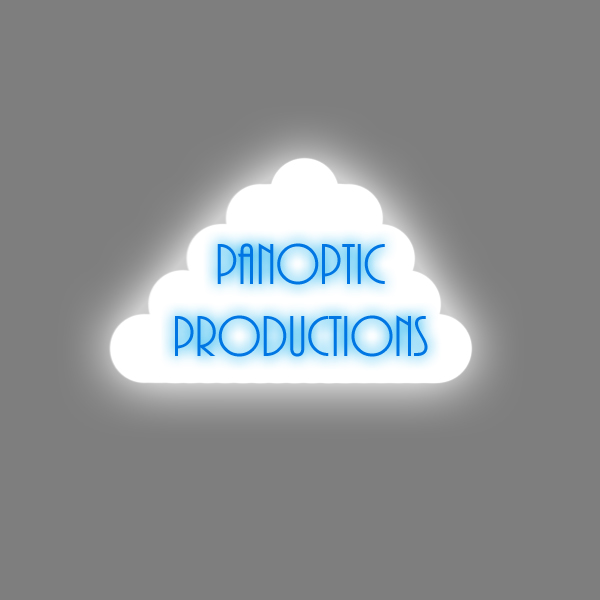
This design is inspired by a drawing I made a long time ago. Cartoon clouds are often used in work by artist who specialise in forms that are less realistic. I think the shape of the cloud works well, as does the font. The font is elegant, and the blue corroborates with the cloud - blue is the colour of rain, and rain comes from clouds. I added a glow to both the cloud and the text, to make them seem more dainty and angelic. The image would not include the grey background; the grey would be transparent. However, I made an example with a grey background to show the shape of the cloud.
Design 2

This is the second design I made. The white area is actually transparent. I decided to use three different faces and different angles as it related to our company name. The text, as well as the drawings, are cartoon-esque and are rather funky. I chose to do it this way as we are only young, and we want to show that creating our thriller opening is fun. I like this design, although I think it is lacking something; I, unfortunately, do not know what this 'something' is.
Design 3

This design is inspired by splats of paint/liquid found in the environment. I chose bold purples and pinks as they stood out from the page, and then used a bold and eye-catching font. This design is simple, yet effective, and I think it would work well when placed into Livetype.
Design 4


This design is my favourite from the set. I think this is a satirical take on Columbia Pictures ident. They use a woman standing on a podium, holding a light. I chose to use a character I created, and place him on a podium. As we come from an industrialised area, I chose to add a skyline to the design. The white area is transparent; when placed into Livetype, I would use a background on moving clouds - this is another reference to Columbia Pictures. The text is rather wacky, and matches the design; the text is separate as I want to be able to move it freely on the page - I do not know the resolution that Livetype works at, therefore I estimated when creating the design. By having the text separate, I can place it exactly where I want on the screen, without altering the design.
0 comments:
Post a Comment
Please comment sensibly. Thank you.