Thursday, 30 December 2010
Name of Film
As a group, we have decided on the name of our film. We chose the title: 'Lost Signal', as our protagonists leaves her group of friends after losing signal on her mobile. When she returns, she finds that her friends are missing, and attempts to find them - leading her into the path of her stalker.
Tuesday, 28 December 2010
Sabotage, 1935
Sabotage was a another of Alfred Hitchcock's thrillers. Made in the 1935, uses dramatic irony as a way of keeping the audience's attention and entertaining them. Dramatic irony is when some of the characters within the world of the film do not know specific details. However, we as the audience know everything. This is a way for us to both relate to the characters, and to sympathize with them.
With regards to this film, Stevie's sister's husband - Verlock - gives Stevie a package to deliver. Stevie must deliver the package, which contains a bomb, by half one. Stevie does not know of the bomb inside the package - this is an example of dramatic irony. Time passes, and Stevie becomes distracted, eventually leading to the bomb going off in Stevie's hands.

Additionally, Hitchcock uses contrapuntal music when the boy is in the market. To the boy, he is just wandering around the market, but as we know the package contains a bomb - thus the boy is wasting time.
Finally, as the scene nears its end, the music becomes more and more dramatic. This builds the tension, and places the audience of the edge of their seat; the audience is expecting the bomb to go off.
With regards to this film, Stevie's sister's husband - Verlock - gives Stevie a package to deliver. Stevie must deliver the package, which contains a bomb, by half one. Stevie does not know of the bomb inside the package - this is an example of dramatic irony. Time passes, and Stevie becomes distracted, eventually leading to the bomb going off in Stevie's hands.
How Does Hitchcock Create Suspense and Tension?
There are several ways that Hitchcock creates suspense within the film. One of these ways is the use of the close-up shot. These shots allow the audience to witness the boy's facial expressions and emotions. Moreover, the shots of the package keep the audience thinking about it, and urge the viewer to feel sympathy for Stevie.Additionally, Hitchcock uses contrapuntal music when the boy is in the market. To the boy, he is just wandering around the market, but as we know the package contains a bomb - thus the boy is wasting time.
Finally, as the scene nears its end, the music becomes more and more dramatic. This builds the tension, and places the audience of the edge of their seat; the audience is expecting the bomb to go off.
Monday, 27 December 2010
Mobygratis - Approval
A few hours ago, I received an two emails from mobygratis confirming the licensing of two tracks.


Saturday, 25 December 2010
Mobygratis
Today, I signed up to mobygratis.com. Straight away, I began browsing through the wide range of music, and came across two tracks that would fit the opening scenes of our thriller. I have requested the use of both tracks, and will be waiting for a reply.
I will also be visiting sites such as unsigned.com, to try and find other music.
 As a group, we want to secure the licensing of about ten tracks, meaning that we have a wide variety of music to choose from.
I will also be visiting sites such as unsigned.com, to try and find other music.

Thursday, 23 December 2010
Idents
Wednesday, 22 December 2010
Location Research

This is a picture I took at the beginning of November. I think this area would be good to use in our thriller, as it is a rather quiet place. It is local, and the length of the road would provide a very good shot. Moreover, if the weather conditions are similar to the photo, it would really add a scary edge to our work.
Monday, 20 December 2010
Ident and Logo Ideas.
Over the past few days, I have created four separate ident/logo designs. Each one is different to the next, as I wanted to make the decision process easier; if the ident/logos are extremely similar, it would be hard to choose a favourite. I have saved all the files in two file formats: .psd, the Photoshop file so that I can edit them later, and .png, so that the empty areas remain transparent.
We chose the name 'Panoptic Productions' as the word 'panoptic' means to view things from many directions. This links to our coursework, as each shot of our thriller will have to be viewed from different directions in order to make it a high-quality opening.
Design 1


We chose the name 'Panoptic Productions' as the word 'panoptic' means to view things from many directions. This links to our coursework, as each shot of our thriller will have to be viewed from different directions in order to make it a high-quality opening.
Design 1
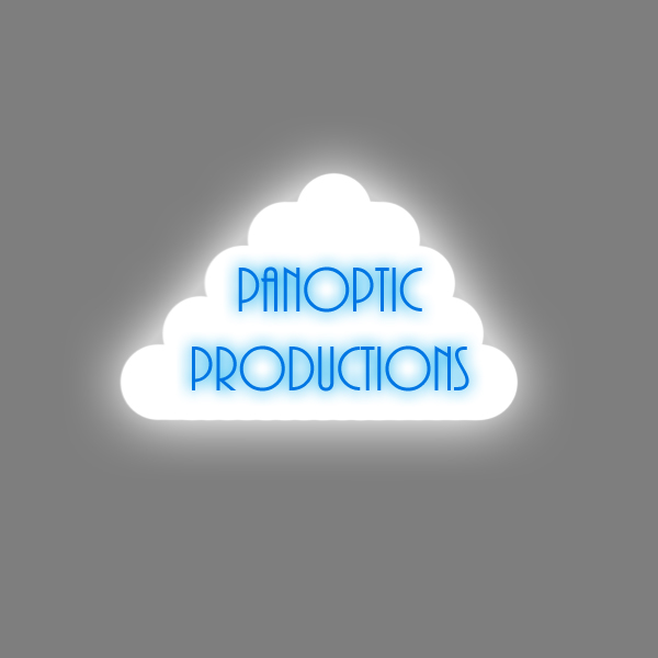
This design is inspired by a drawing I made a long time ago. Cartoon clouds are often used in work by artist who specialise in forms that are less realistic. I think the shape of the cloud works well, as does the font. The font is elegant, and the blue corroborates with the cloud - blue is the colour of rain, and rain comes from clouds. I added a glow to both the cloud and the text, to make them seem more dainty and angelic. The image would not include the grey background; the grey would be transparent. However, I made an example with a grey background to show the shape of the cloud.
Design 2

This is the second design I made. The white area is actually transparent. I decided to use three different faces and different angles as it related to our company name. The text, as well as the drawings, are cartoon-esque and are rather funky. I chose to do it this way as we are only young, and we want to show that creating our thriller opening is fun. I like this design, although I think it is lacking something; I, unfortunately, do not know what this 'something' is.
Design 3

This design is inspired by splats of paint/liquid found in the environment. I chose bold purples and pinks as they stood out from the page, and then used a bold and eye-catching font. This design is simple, yet effective, and I think it would work well when placed into Livetype.
Design 4


This design is my favourite from the set. I think this is a satirical take on Columbia Pictures ident. They use a woman standing on a podium, holding a light. I chose to use a character I created, and place him on a podium. As we come from an industrialised area, I chose to add a skyline to the design. The white area is transparent; when placed into Livetype, I would use a background on moving clouds - this is another reference to Columbia Pictures. The text is rather wacky, and matches the design; the text is separate as I want to be able to move it freely on the page - I do not know the resolution that Livetype works at, therefore I estimated when creating the design. By having the text separate, I can place it exactly where I want on the screen, without altering the design.
Visits
